Client
Kin
Services
Flipsters
Gabby Mendoza
Senior Designer
Ben Fowler
Designer
John La Motta
Creative Director
Going with the flow
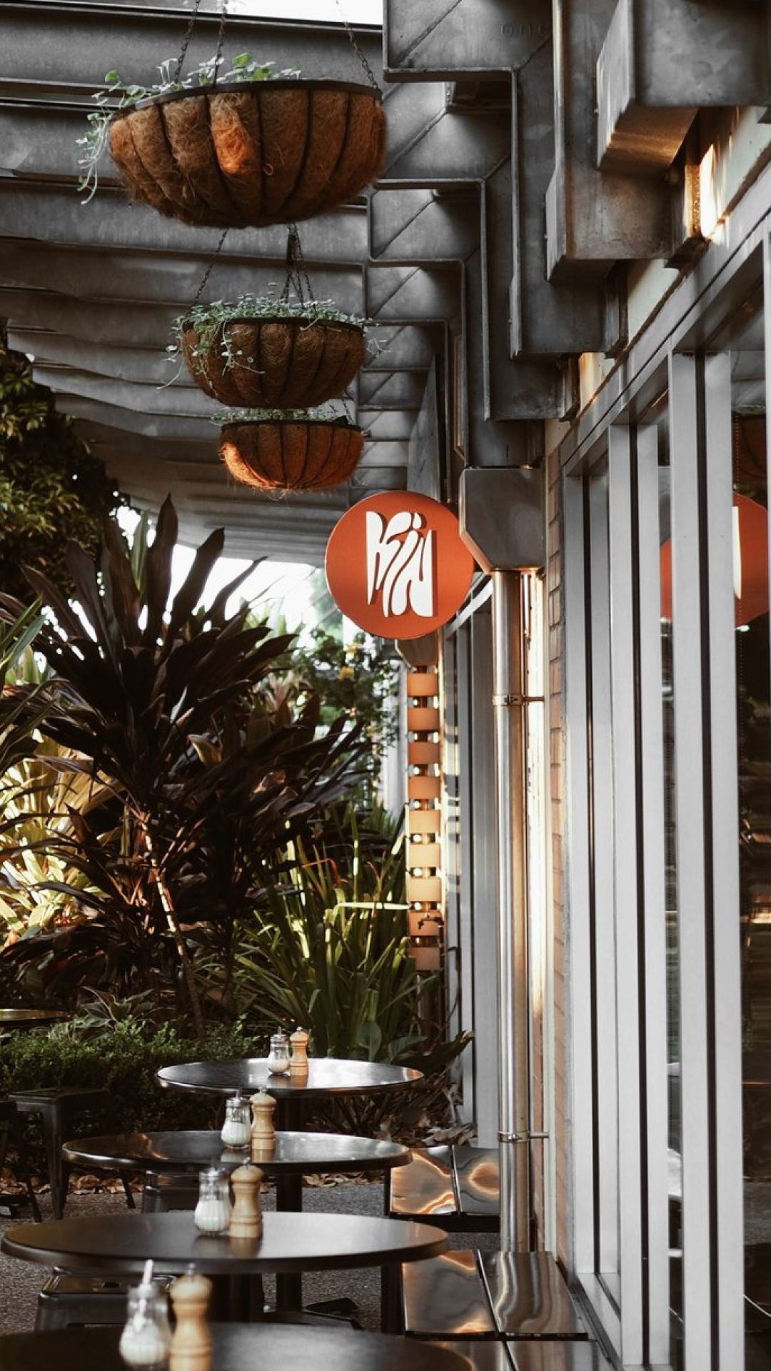
Kin & Co is a charming cafe nestled in the heart of Teneriffe, Brisbane.
Known for its welcoming atmosphere and community-focused approach, this local hotspot wanted to revitalise their brand to signal their resurgence and rebirth after the pandemic.
We suggested they drop the ‘Co’ to have a more kinetic impact and go with the flow.

A new leaf
We worked with the Kin team to workshop four treatments focused on areas of the Kin experience, eventually settling on the concept of ‘going with the flow’.
The concept is representative of Kin’s location on the river and the café’s organic ability to coalesce ingredients and flavours while serving as a nexus for the community to meld.
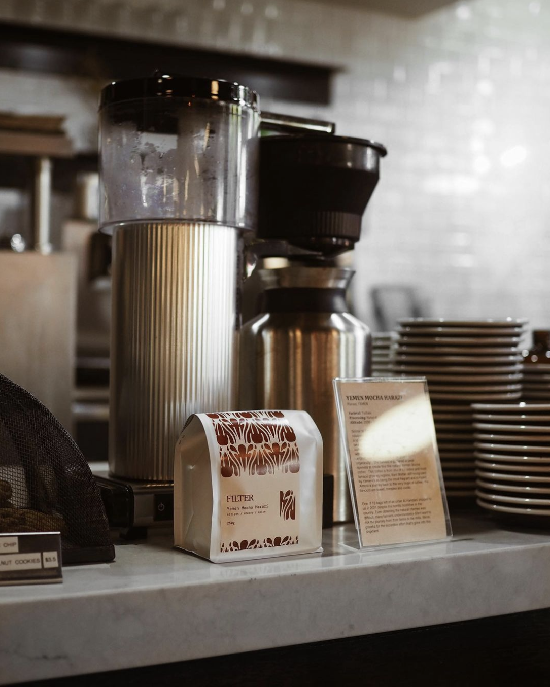


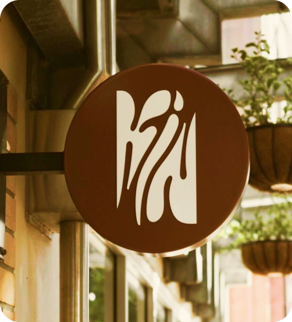
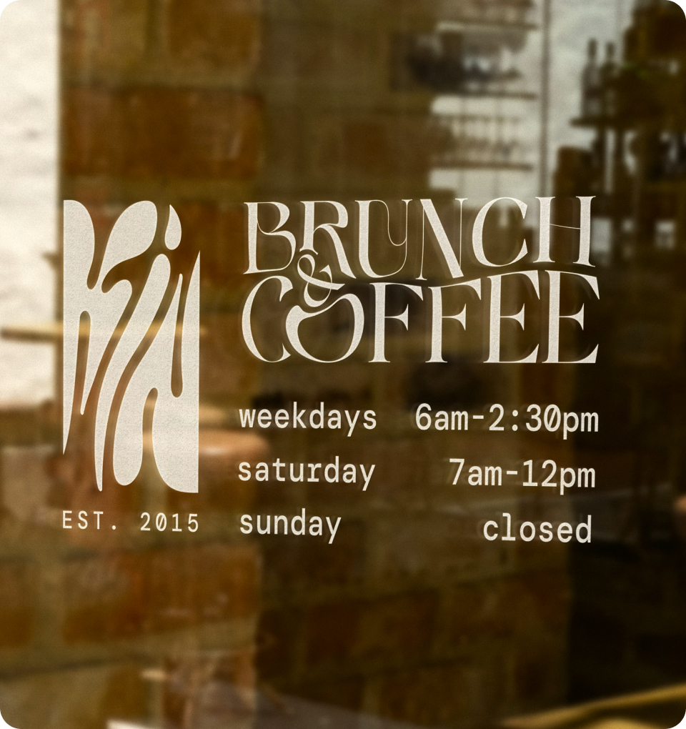
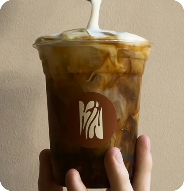

A flexible brand centrepiece
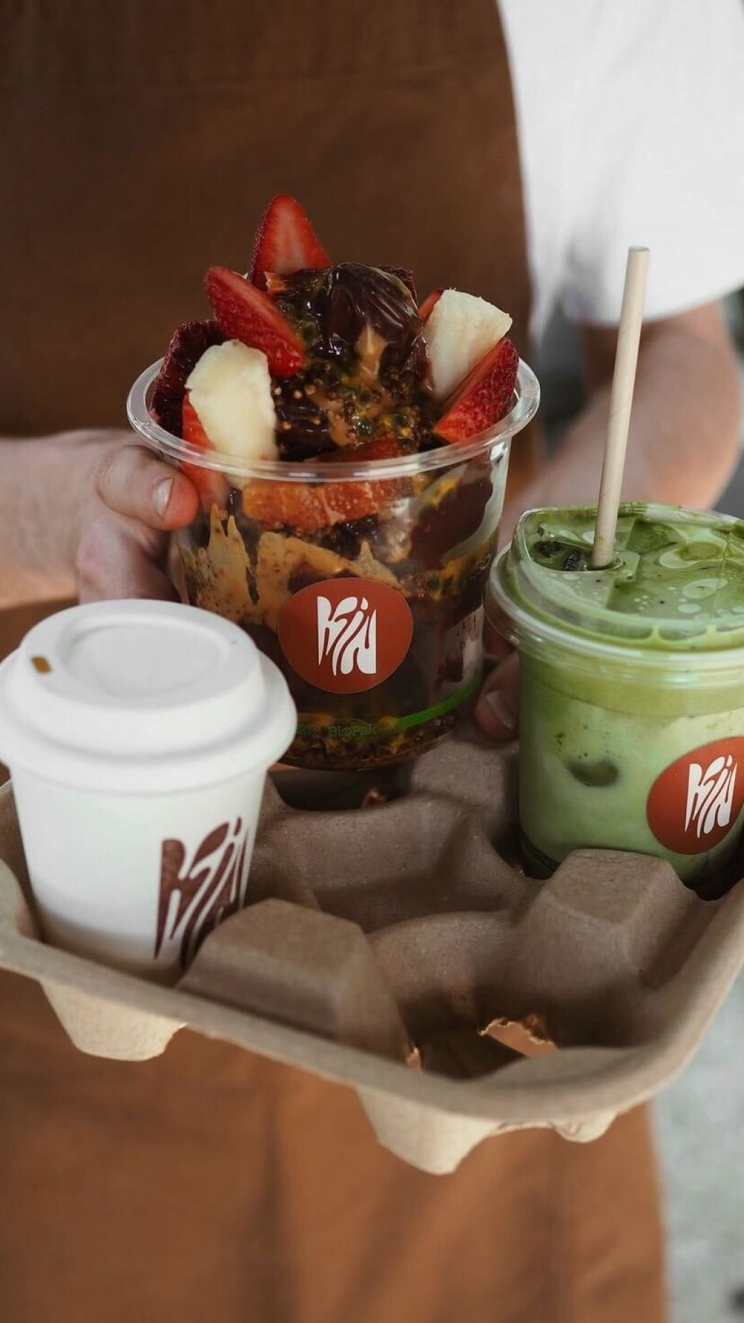
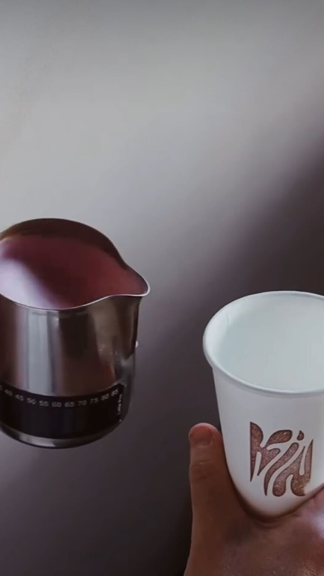
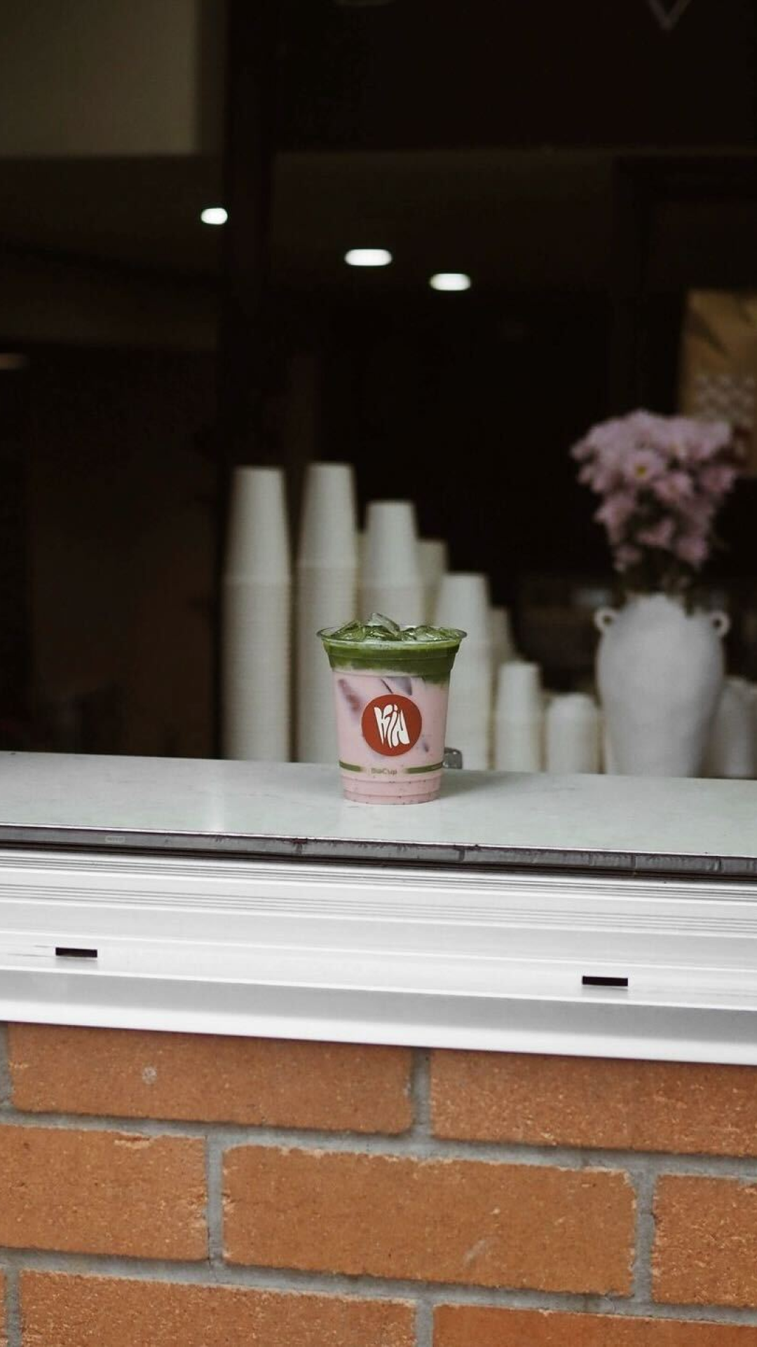
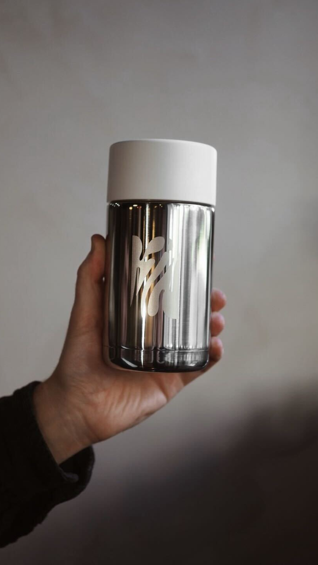
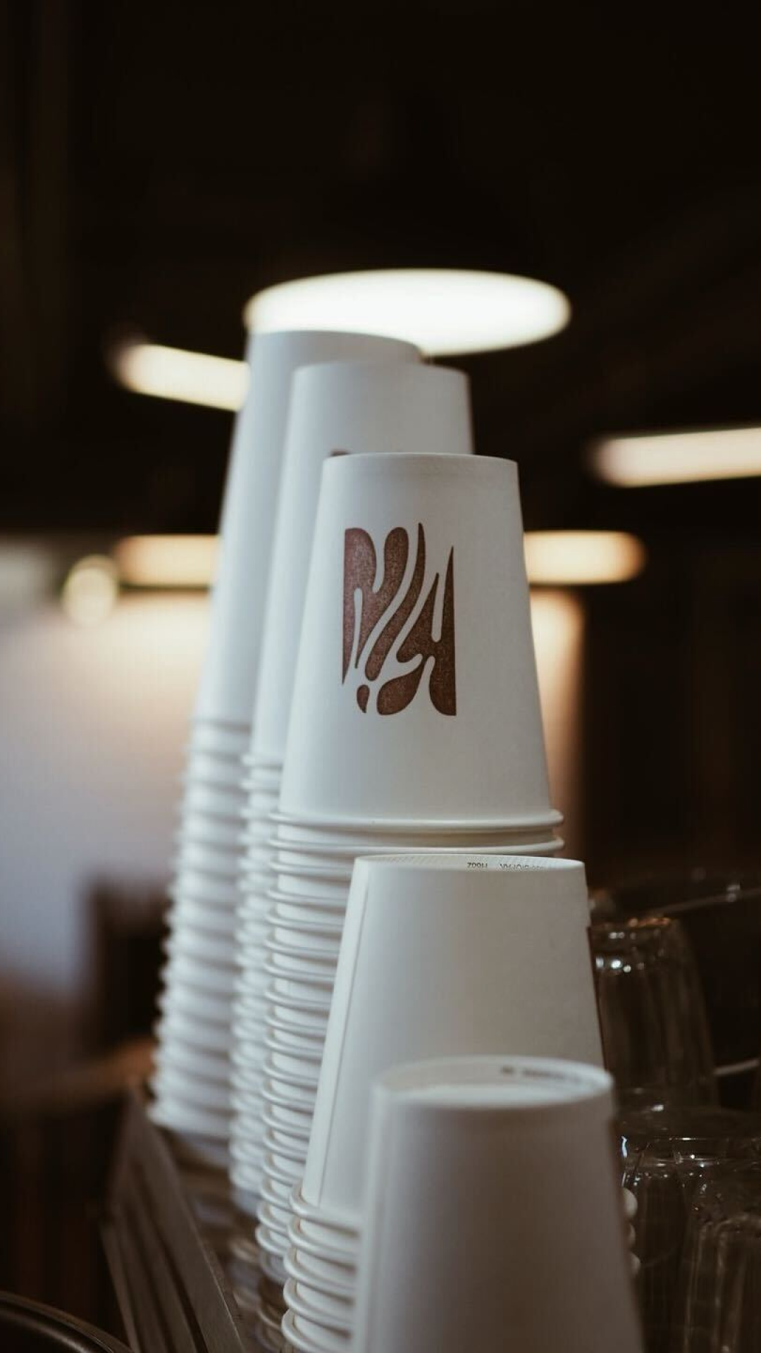
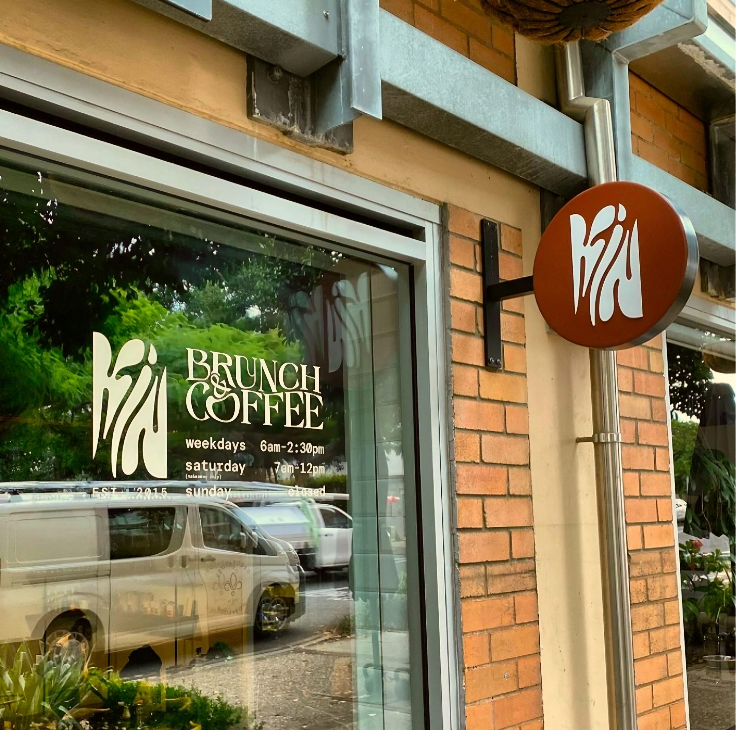
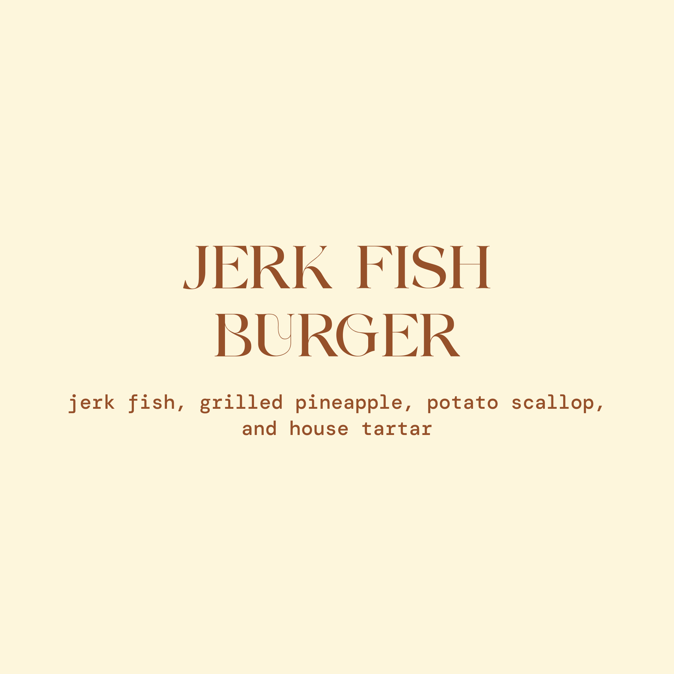
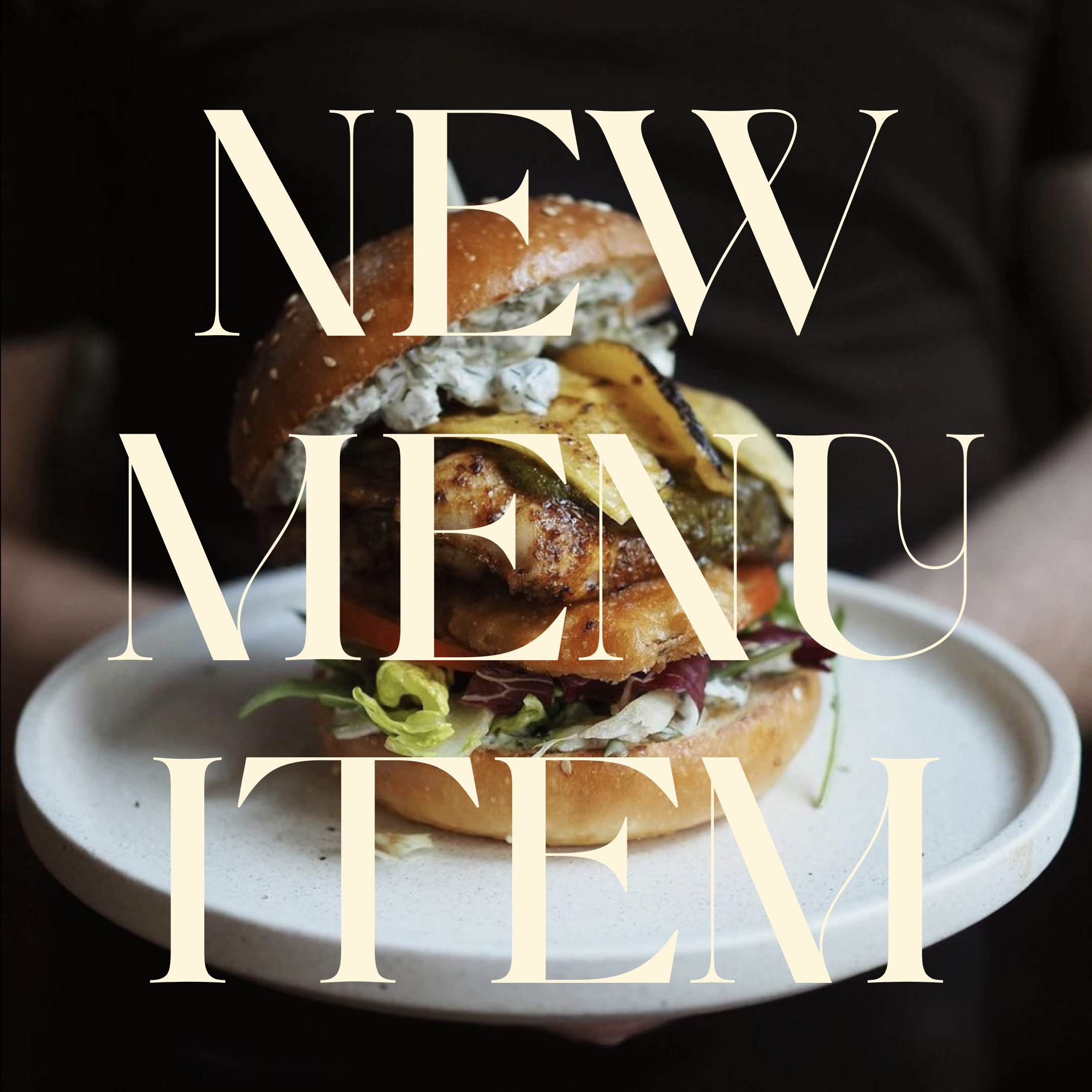
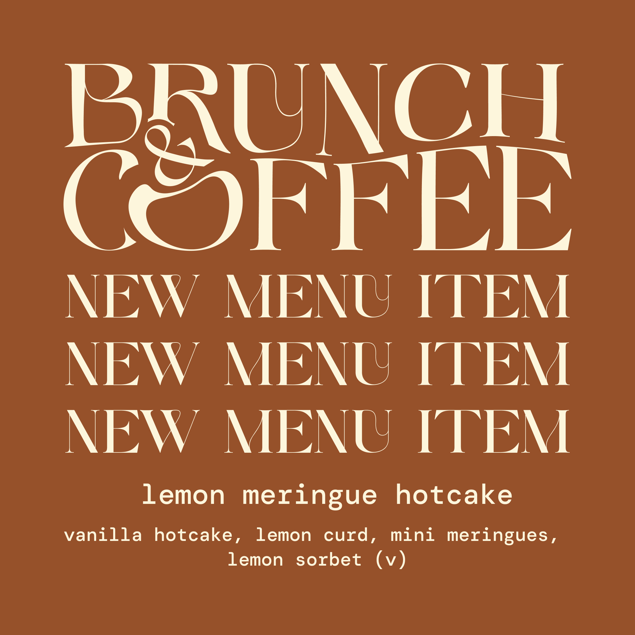
We created an abstract logo mark – a flexible brand centrepiece that can adapt to any medium while remaining distinct. The newly crafted logo showcases a remarkable fluidity, representing a departure from the conventional aesthetics of café logos.
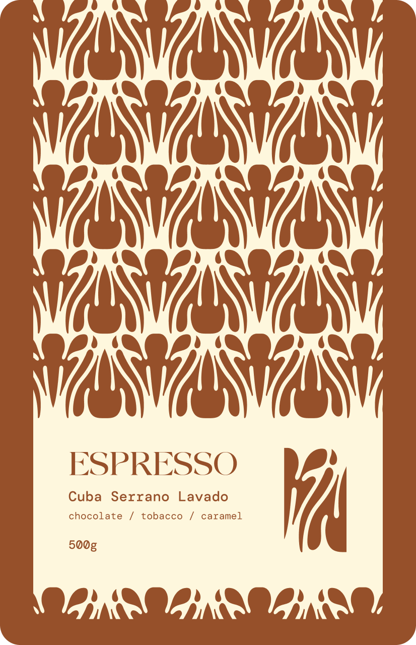
Supporting the logo mark is an interplay of fluid and elegant shapes framed against stark anchoring typography and a focused, muted palette.
From the client
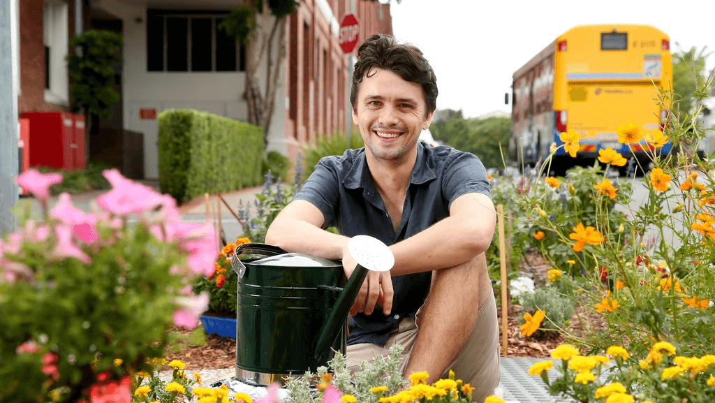
Tim
Business Owner of Kin
Flip’s work on my branding, Kin, was simply outstanding. They captured the essence of my café perfectly, creating a unique and inviting identity that truly resonates with our values.
Kin now boasts a standout yet warm and welcoming brand, thanks to their expertise. I couldn’t be happier with the results.
Key outcomes
Refreshed coffee cups enjoyed
10,000+
