Melt
Welcome to paradise
FLIPSTERS

Motion Designer

Senior Designer
Senior Account Manager
Creative Director
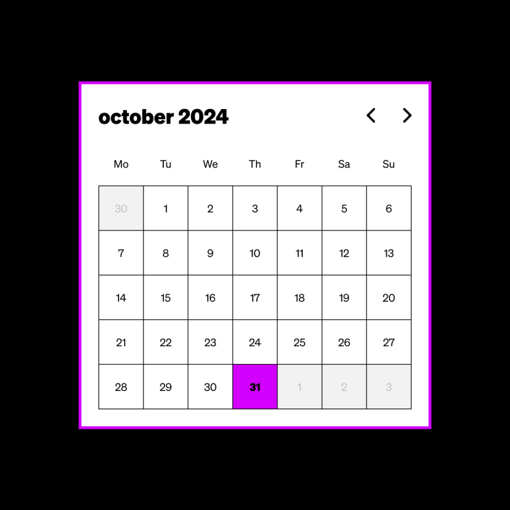
MELT is a new open-access festival of Queer arts and culture across close to 100 Brisbane venues. Brisbane Powerhouse has thrown the doors open to queer performers across the world to make Brisbane fabulous from October through to November 2024.
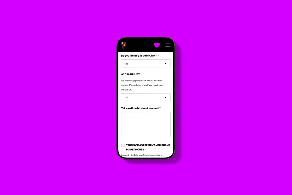
Our task was to create a fun and vibrant website that allowed performers to register their interest initially and pivot into promotion mode.
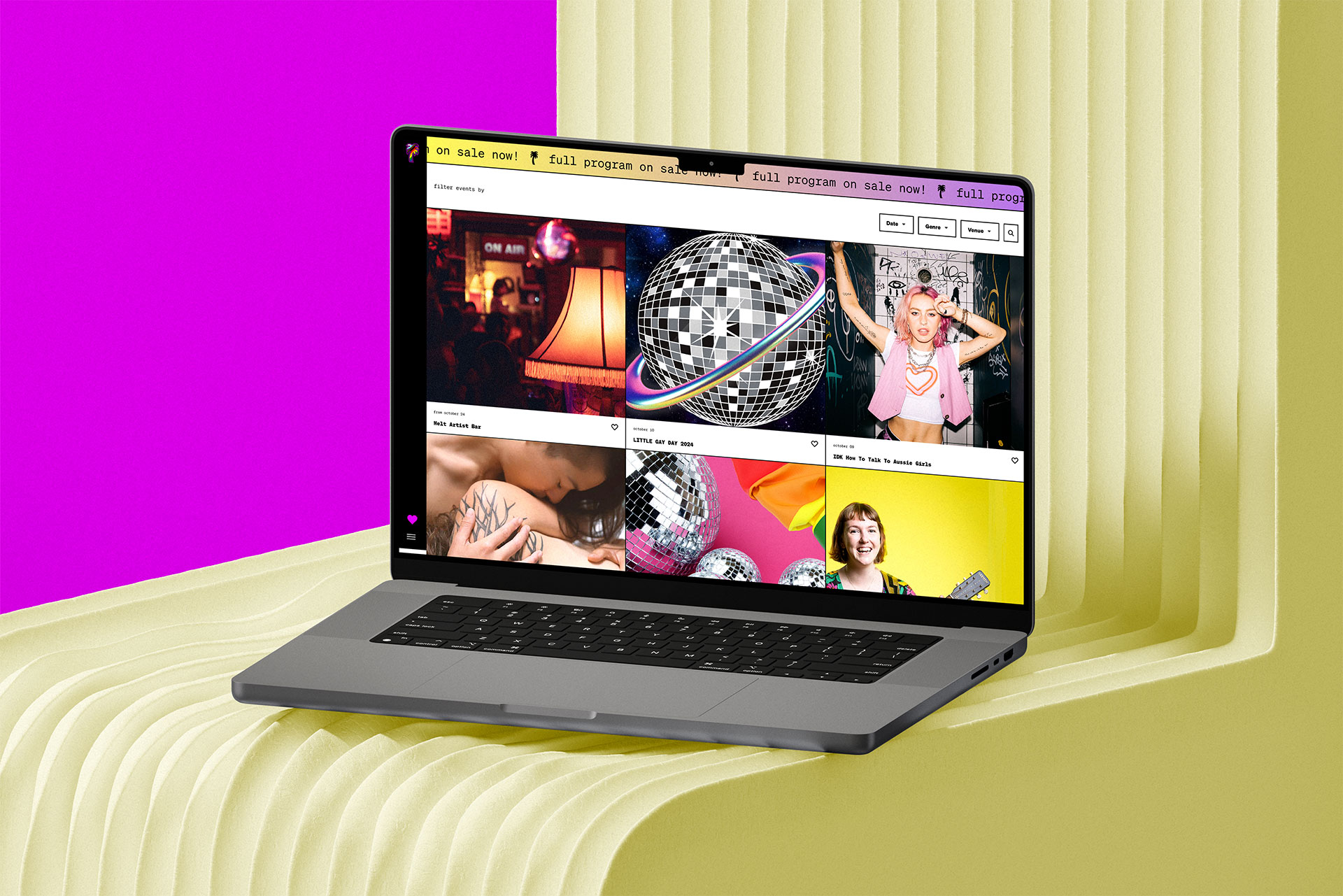
Bringing the festival to life
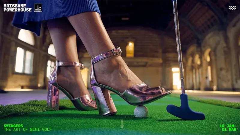
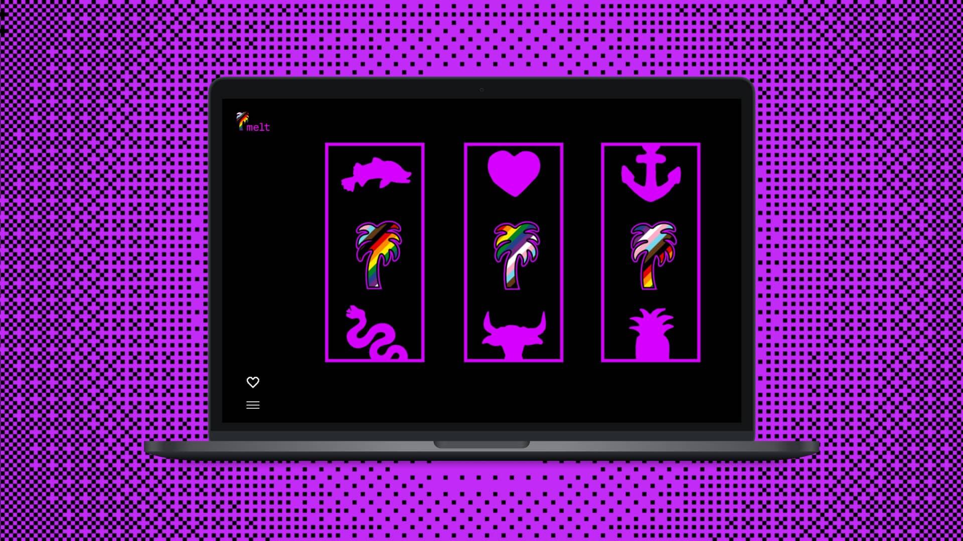
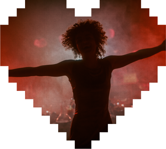
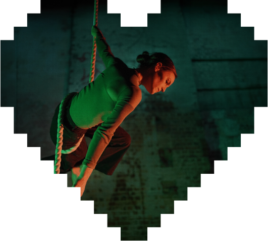
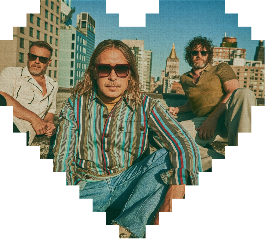
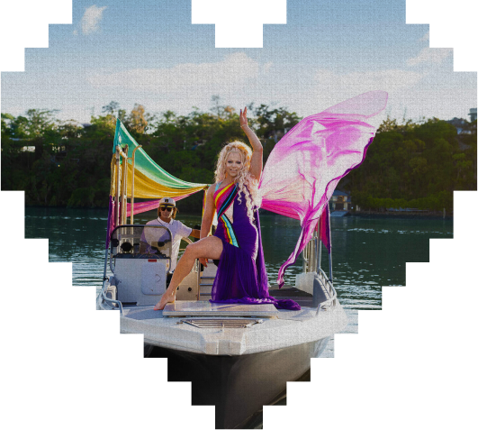
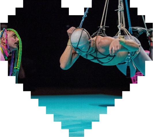
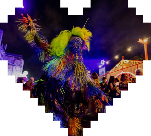
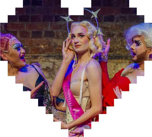
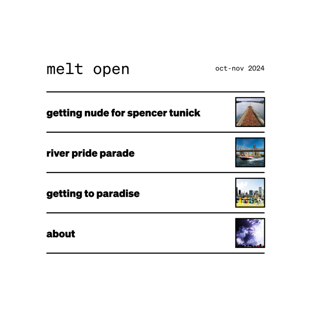
The site design was focused on bringing the vibrancy of the festival to life, without leaning on tired stereotypes. We wanted to remain playful and a bit extra – without obscuring the performances or the performers.
Championing the content, we focused on creating an experience that amplifies the performers while introducing interactions and colour transitions that transport the user to the saturated hues of MELT.
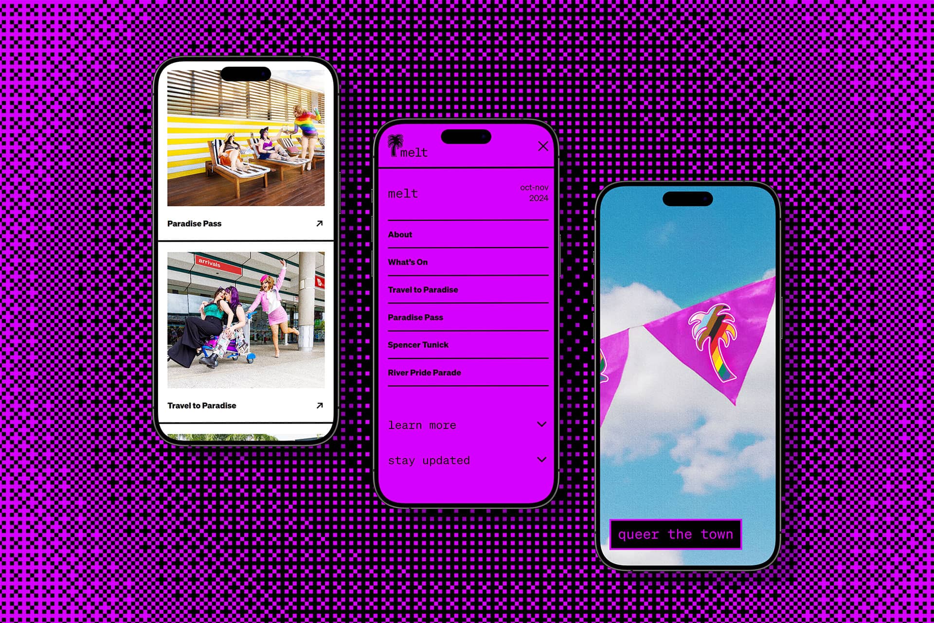
Party at the front, business at the back
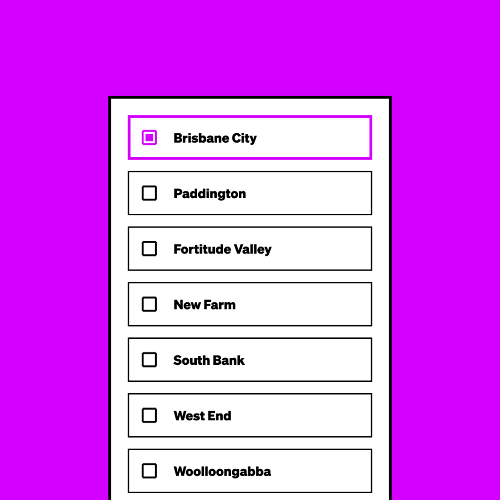
From the high impact mega menu to the transforming navigation cards, this is one of our favourite sites we’ve built – and the best part is that everything is completely CMS’able in a visual WYSIWYG format.
Under the hood the site connects with the Programming Team’s event management system – updating event pages in real time via secure API connection and removing double handling.
It’s all about the vibe
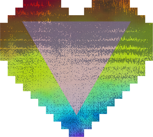
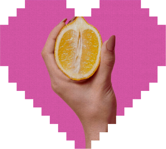
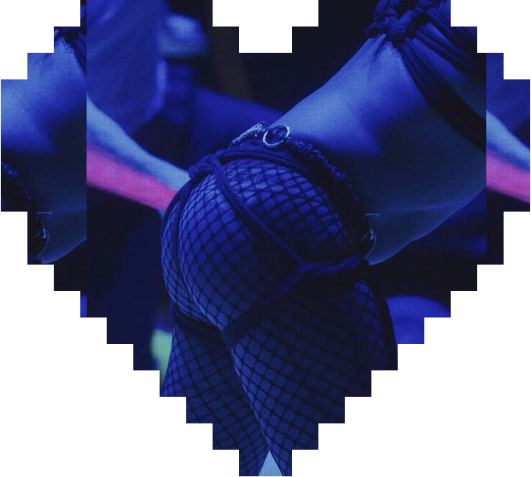
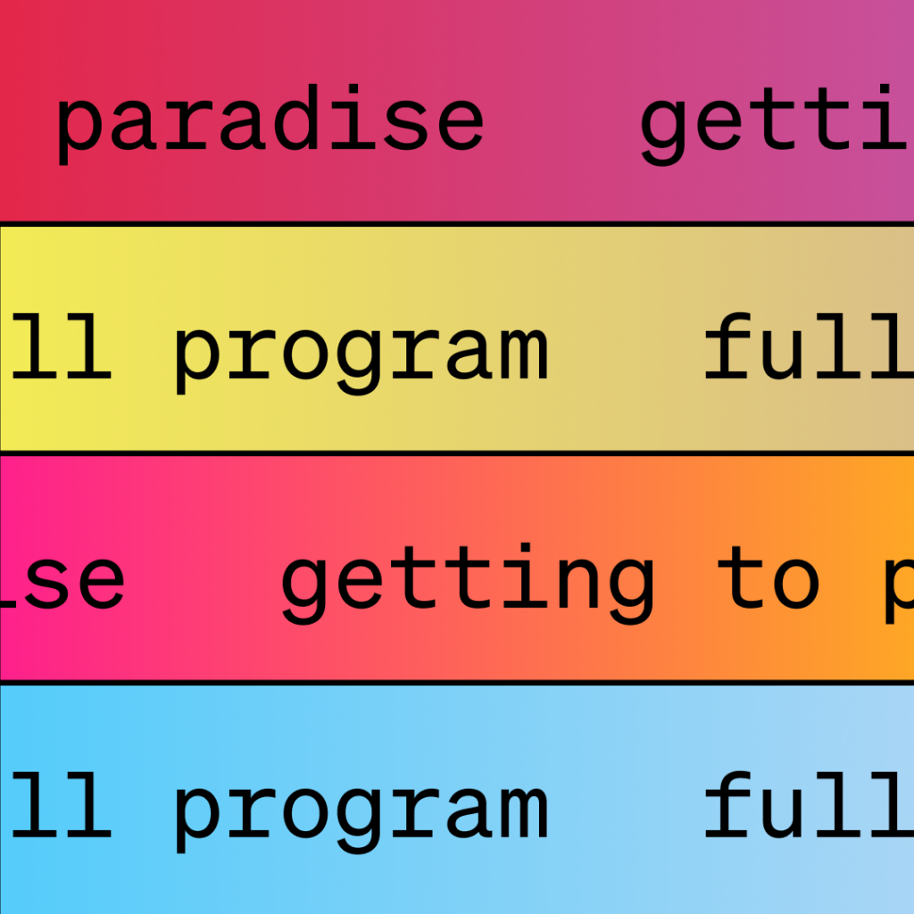
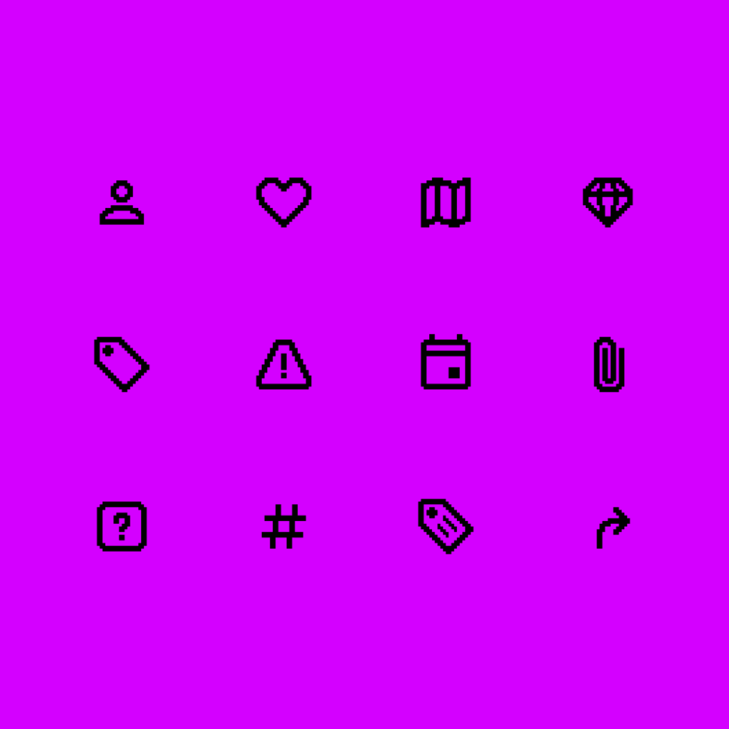
We created a vintage vibe with pixel art icons used throughout the site. Mixing this with a modern set of fresh gradients created a vibrant and stylish finish.
Playful and kinetic design language taking cues from vintage pixel art and sundrenched hues, brought together by silky interaction animations.
NOMINEE
Webby Awards Runner-up
RECOGNITION
BADC Finalist
Results to be proud of
With the launch of the Melt website, Brisbane Powerhouse saw an immense reaction to their call for entries with hundreds of artists, comics and performers from around the country (and the world) submitting to perform.
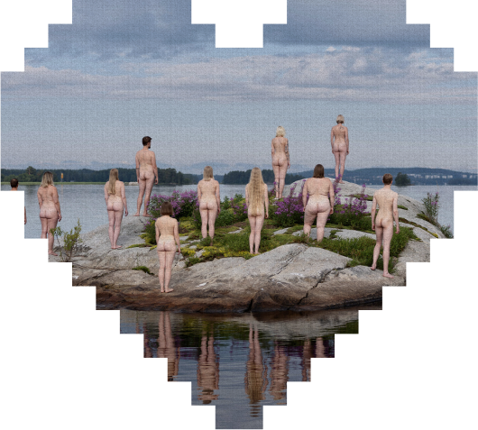
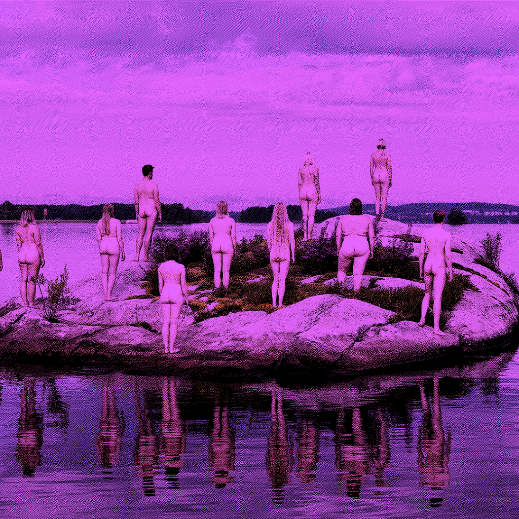
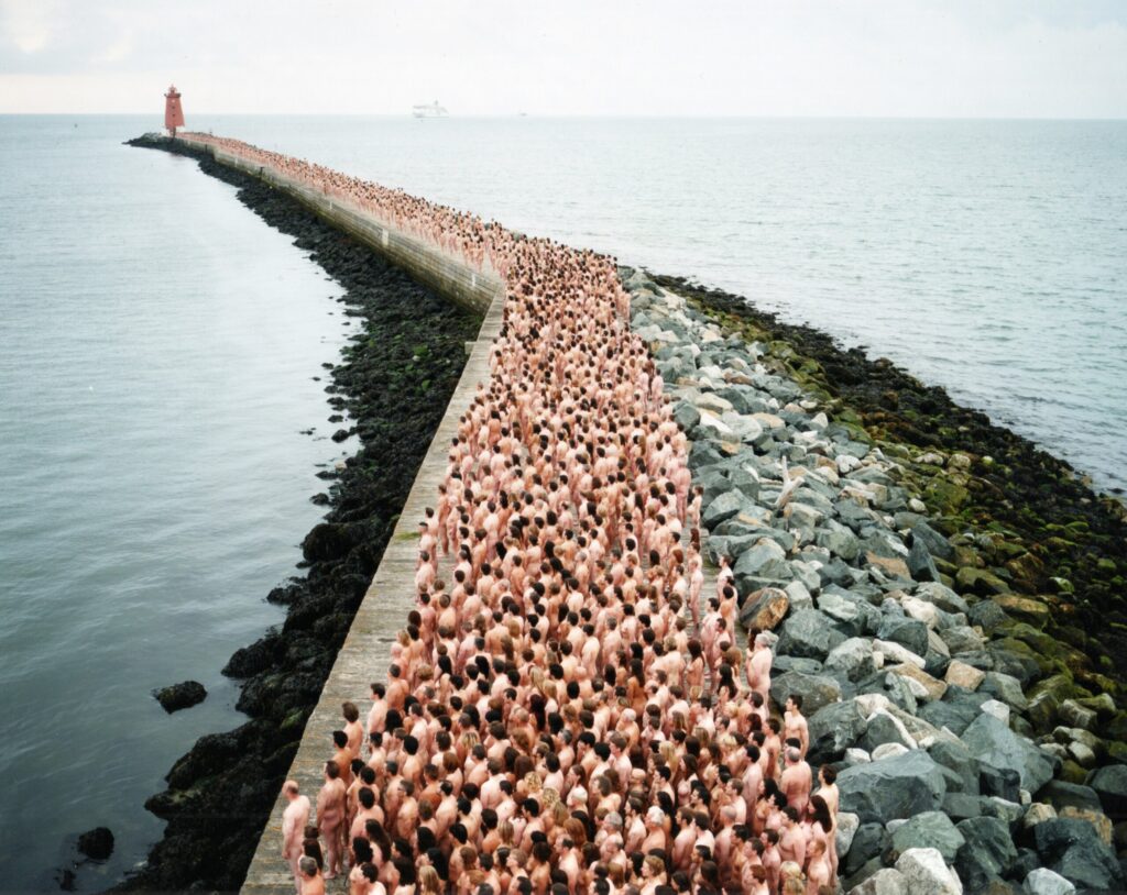
The Spencer Tunick art project received an unprecedented response, with more than five thousand Brisbanites signing up to participate.
FROM THE CLIENT
Working with the team at Flip was a dream. The projects we briefed them on were complicated, with many moving parts, and required creative flair to be used while adhering to our unique brands.
Flip undertook each project with enthusiasm and care – they understood user journeys and foresaw issues before they happened, adding in details that we would never think to ask for.
The result were MASSIVE projects delivered better than we could have expected: the development of the new Brisbane Powerhouse website with an integrated scheduling system, a technical and aesthetic facelift of the Brisbane Comedy Festival, the creation of the Vertigo website that garnered international attention, and the creation of the Melt website that perfectly merged playful with nostalgia, elevating the brand to what it could be.
Through each project the team remained cheerful, eager and a joy to work with. Nothing was too hard, or impossible.
Flip = good people, with good ideas.