Vertigo
From the ground up
FLIPSTERS
Motion Designer
Senior Designer
Creative Director
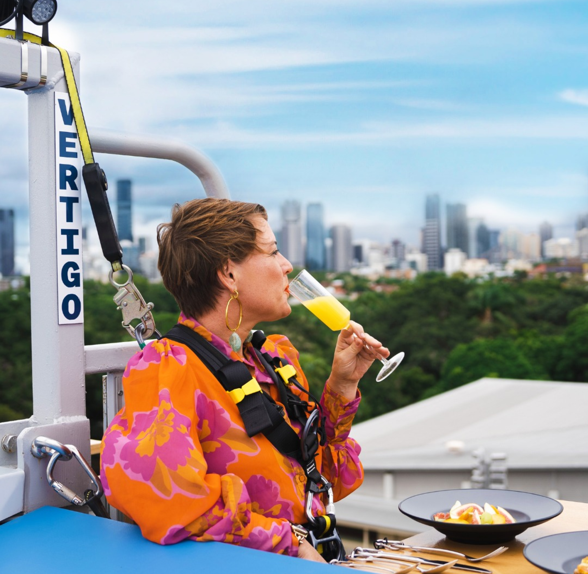
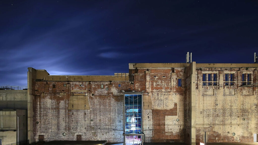
Vertigo is Australia’s first vertical restaurant, perched 17 metres up on the side of the Brisbane Powerhouse.
We were briefed to create the brand and website from the ground up – no small order, but one we relished.
A flexible brand
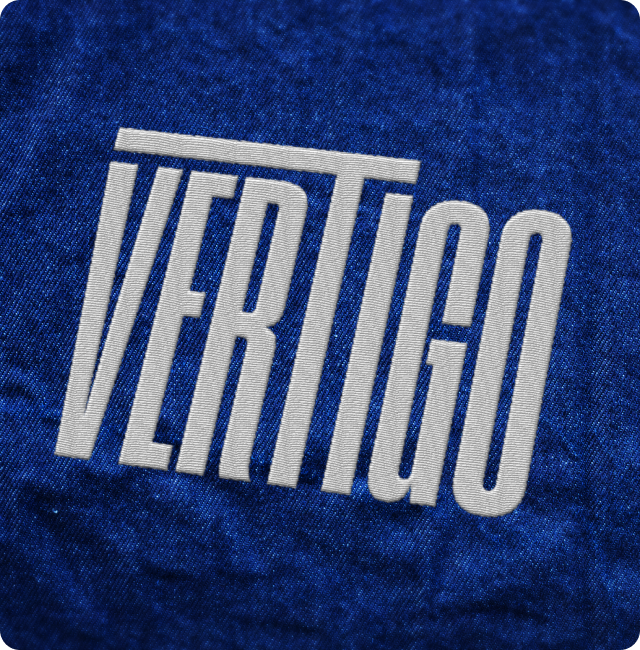
Inspired by the structure of both the Powerhouse and the Vertigo seating placement, we created a mark that blends form, function and feeling.
The verticality of the condensed lettering conjures the scale of the Brisbane Powerhouse wall, with the modified “T” representing the setting of the unforgettable dining experience overlooking the Brisbane skyline.
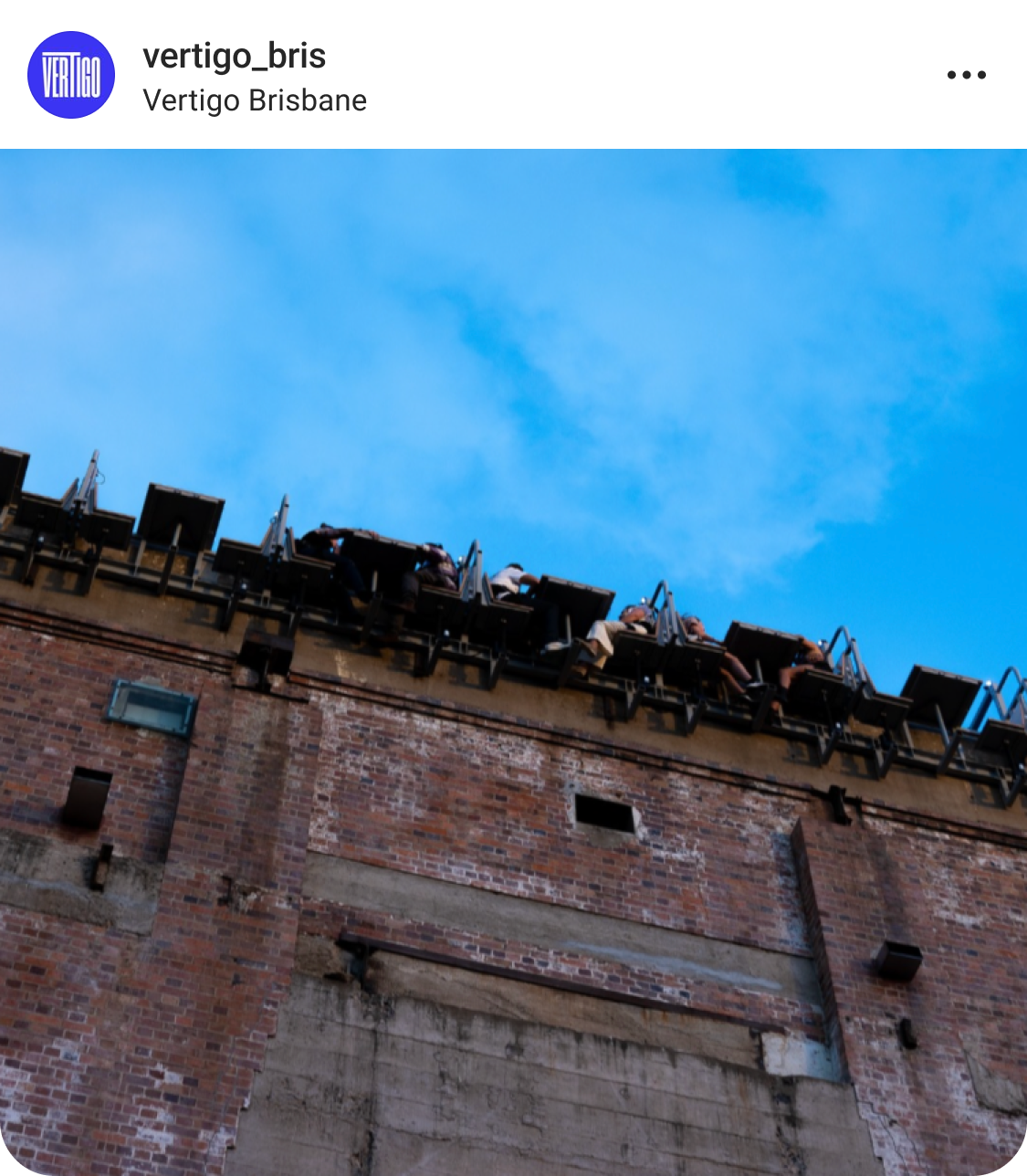
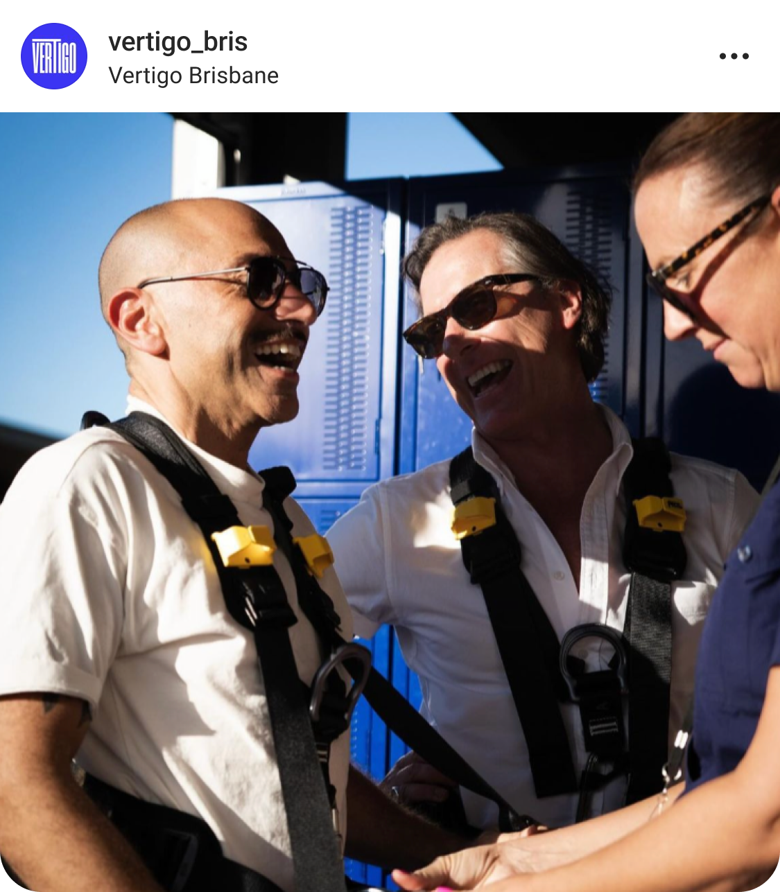
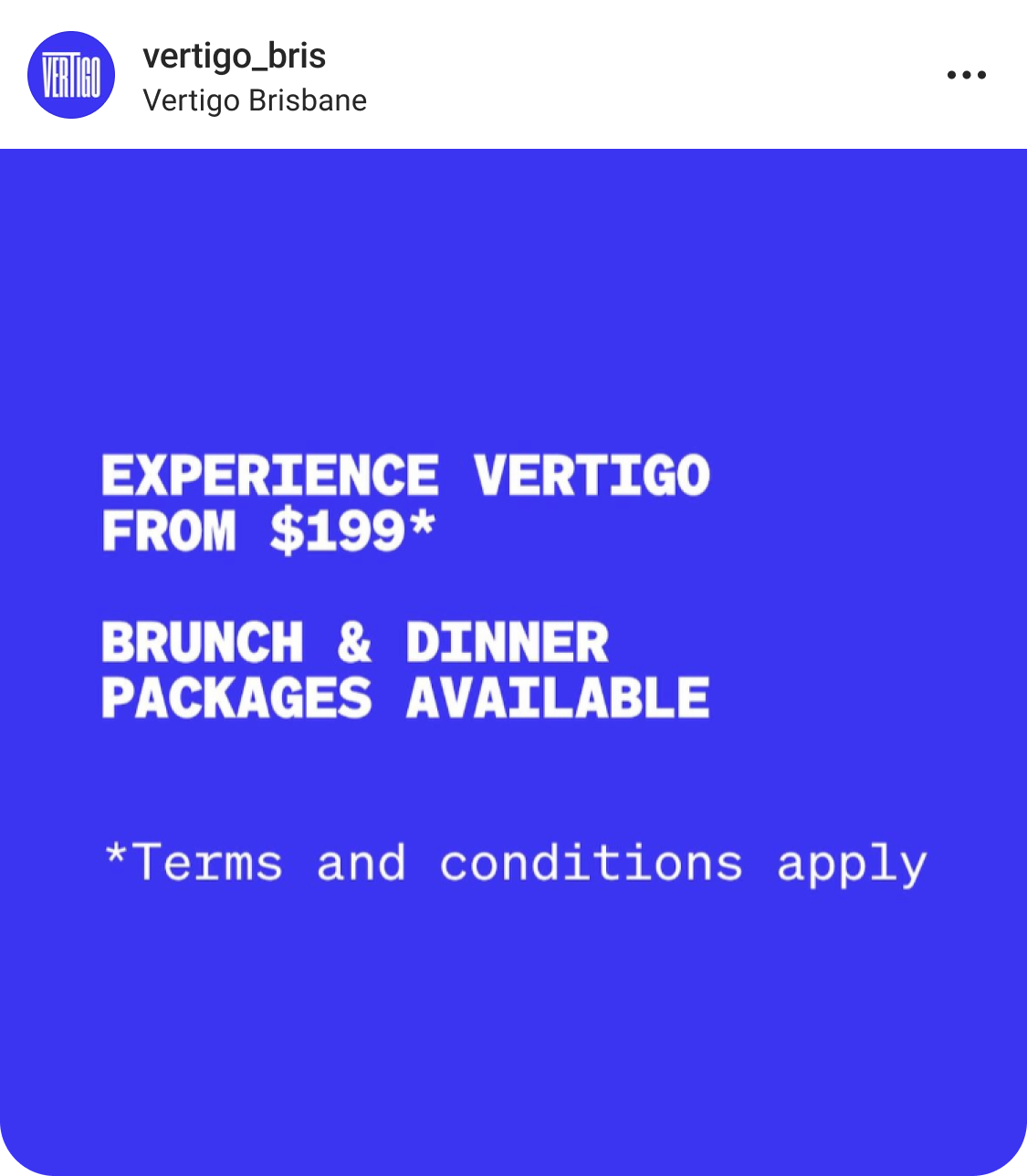
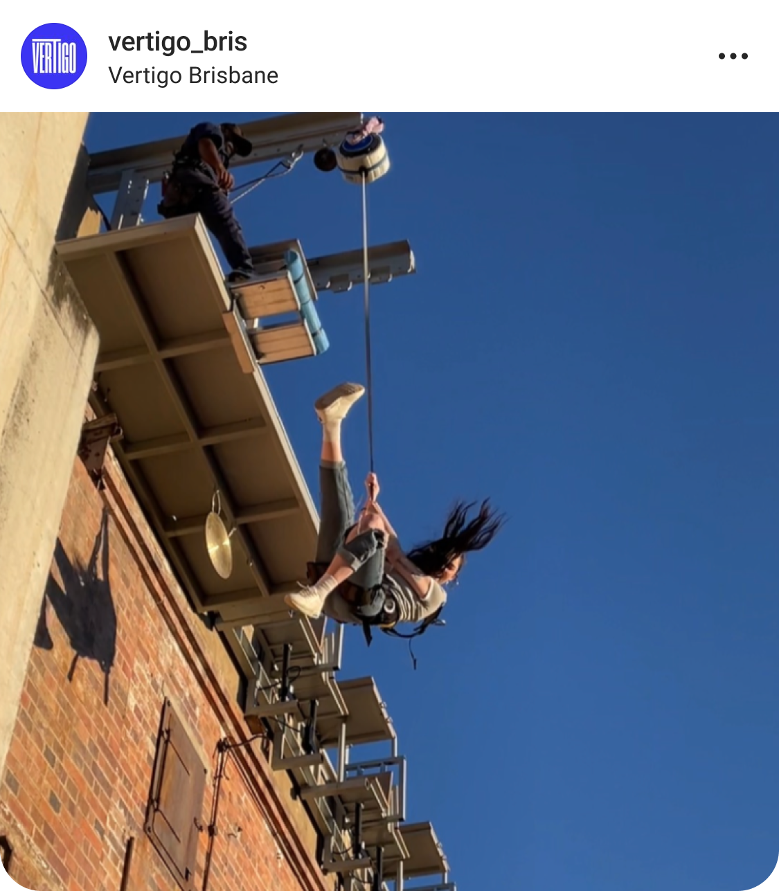
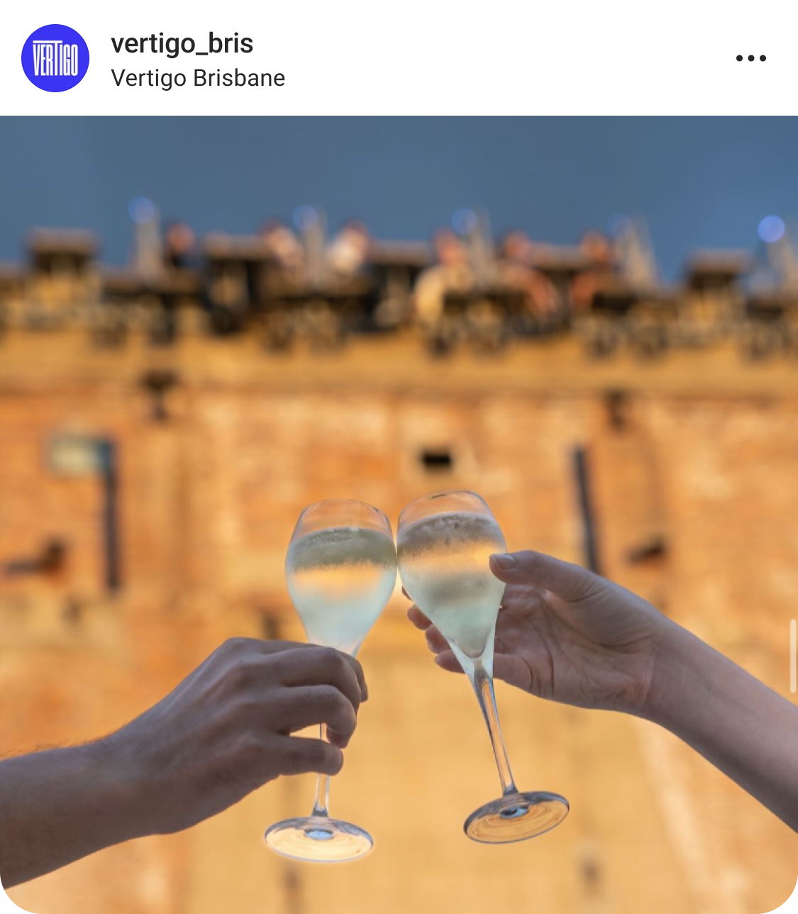
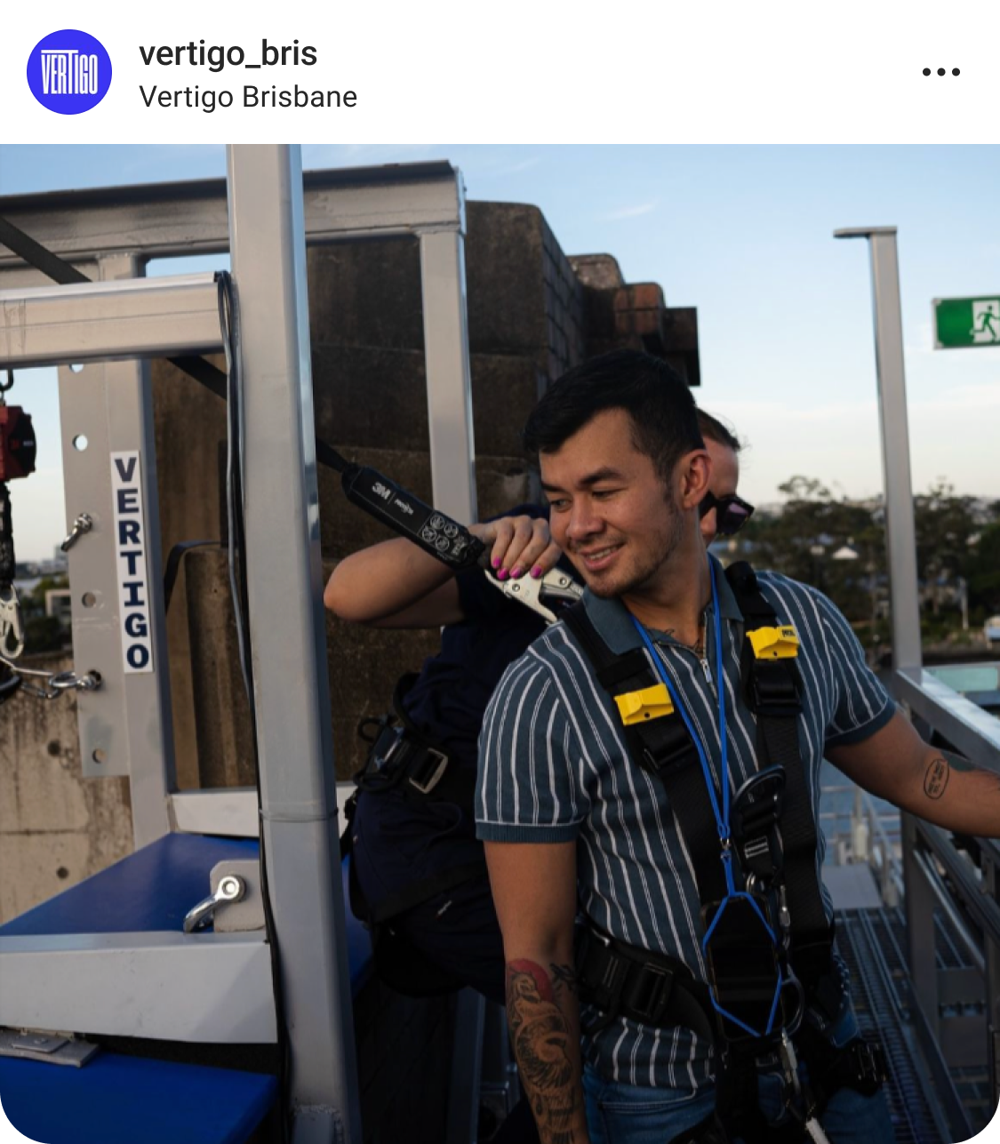
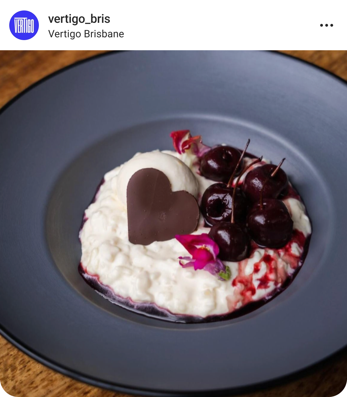
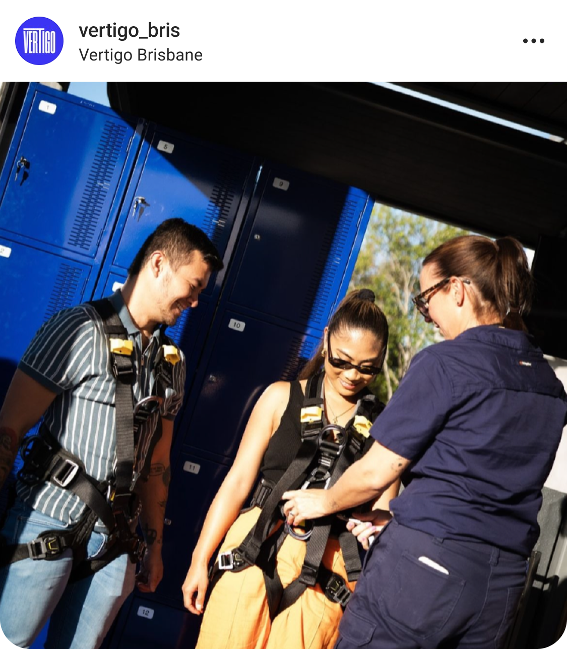
Colours of the night sky
We took cues from the night sky for the palette of the brand, drawing the dusk tones through interesting image treatments to build on the feeling of dining suspended in the night air.
MIDNIGHT
#010310
INDIGO
#3836F6
A woozy scroll
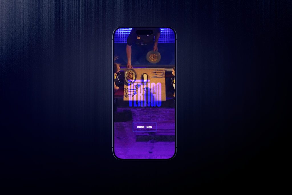
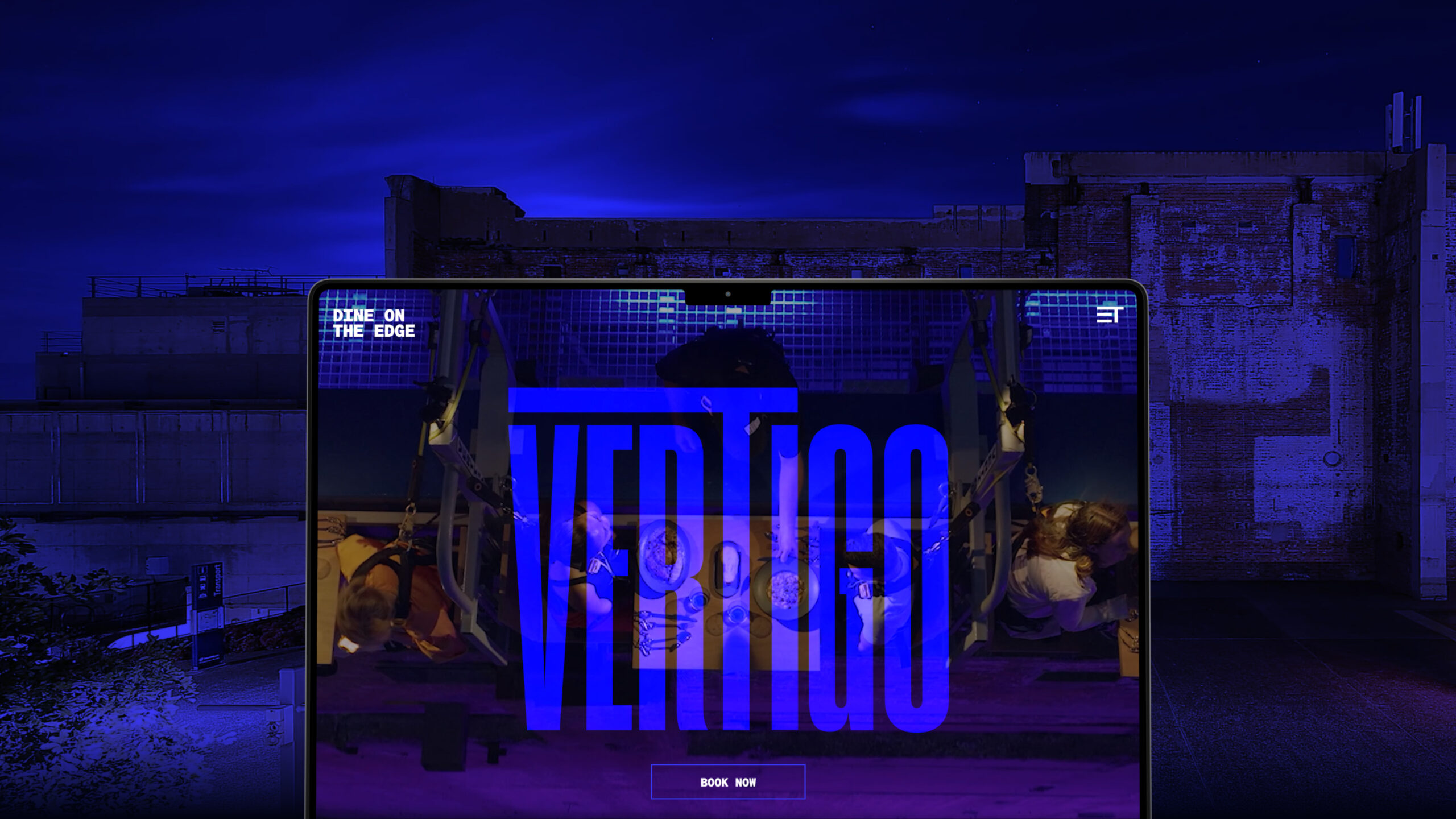
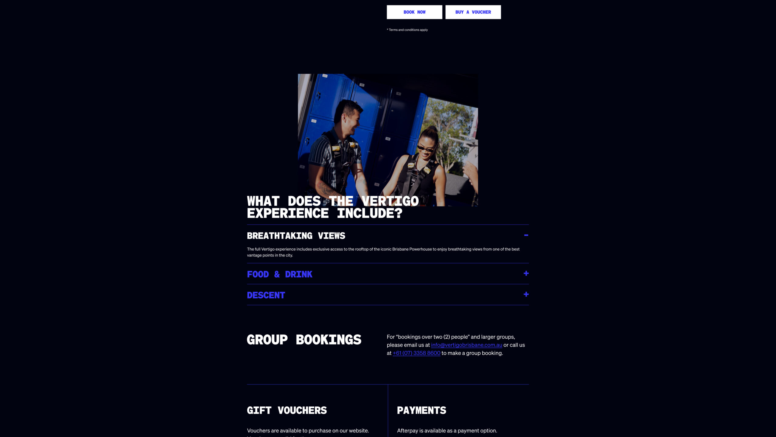
In addition to the branding, we also created a website with a bold UI and a woozy scroll to evoke the true feeling of the experience.
Soaring high
Since launch, Vertigo Brisbane has been featured across countless media outlets. From local media such as Channel 7, Channel 9 and 10, to international household names like The New York Times, Time Out and the Guardian.
Also featured in:











FROM THE CLIENT
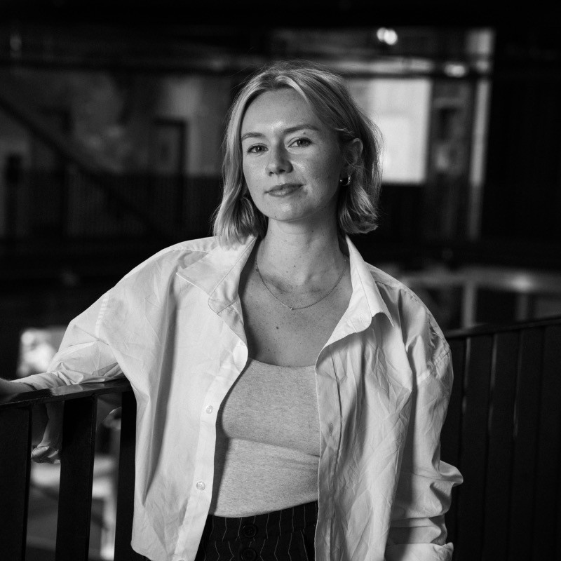
Working with the team at Flip was a dream. The projects we briefed them on were complicated, with many moving parts, and required creative flair to be used while adhering to our unique brands.
Flip undertook each project with enthusiasm and care – they understood user journeys and foresaw issues before they happened, adding in details that we would never think to ask for.
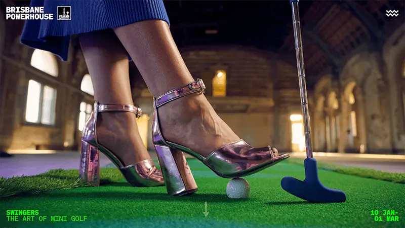
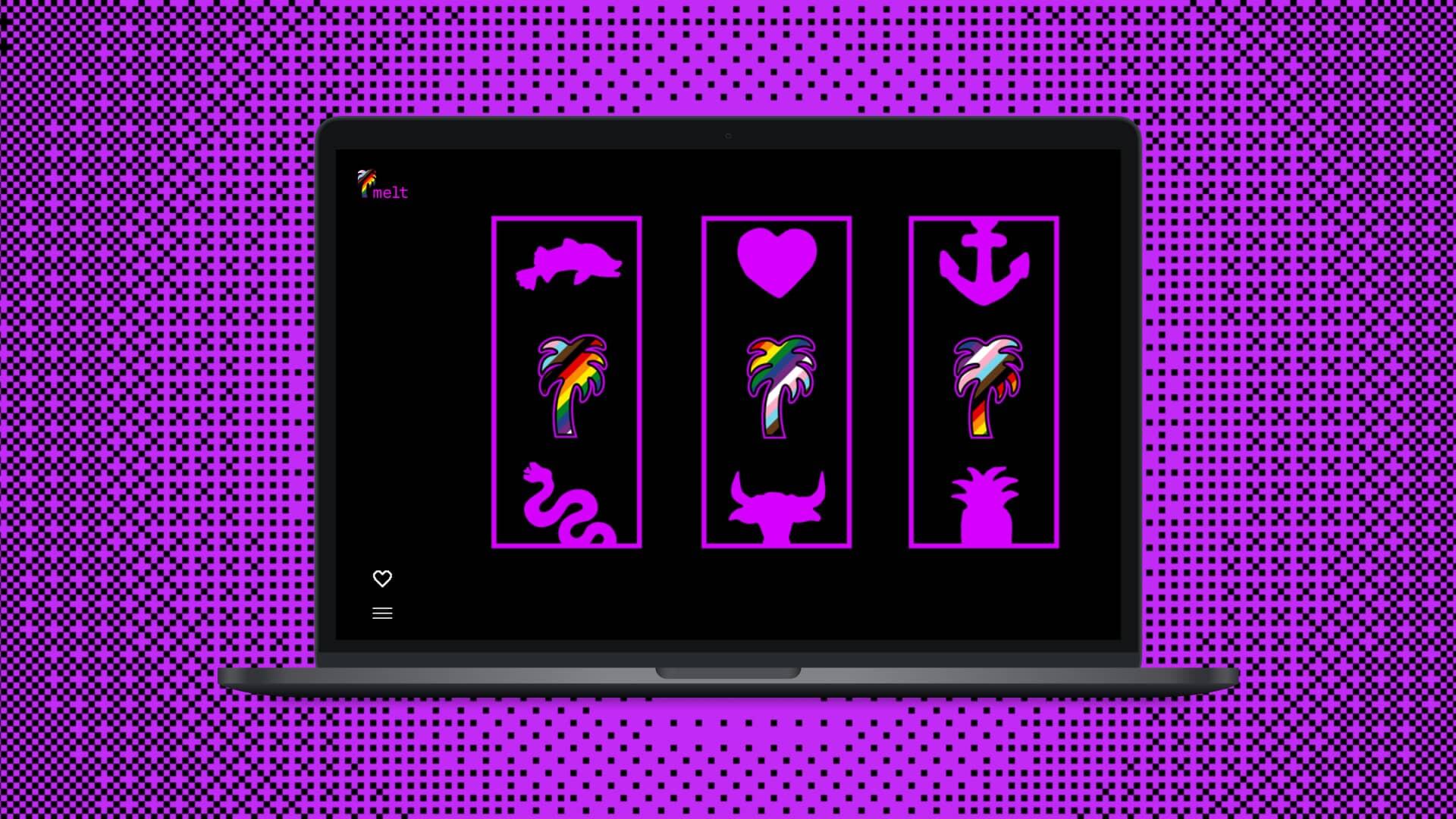
The result were MASSIVE projects delivered better than we could have expected: the development of the new Brisbane Powerhouse website with an integrated scheduling system, a technical and aesthetic facelift of the Brisbane Comedy Festival, the creation of the Vertigo website that garnered international attention, and the creation of the Melt website that perfectly merged playful with nostalgia, elevating the brand to what it could be.
Through each project the team remained cheerful, eager and a joy to work with. Nothing was too hard, or impossible.
Flip = good people, with good ideas.